Festival of Beauty
Promotional Material and Advertising
A much-anticipated annual promotion, Festival of Beauty brings together discounted beauty promotion, a gift with purchase, and a range of engaging in-store activations. A campaign driven by high energy, playful expression, and a desire to connect with our beauty audience, all of which the visual identity must communicate both online and in-store.
Now in its fifth year, we focused on expanding our reach to a younger demographic. This is reflected in the creative direction, being feminine with a Y2K-inspired twist. Building on the established pink base from previous years, we used classic patterns and layered sticker-style motifs in bright and pastel tones to create a fresh, expressive, and contemporary look.

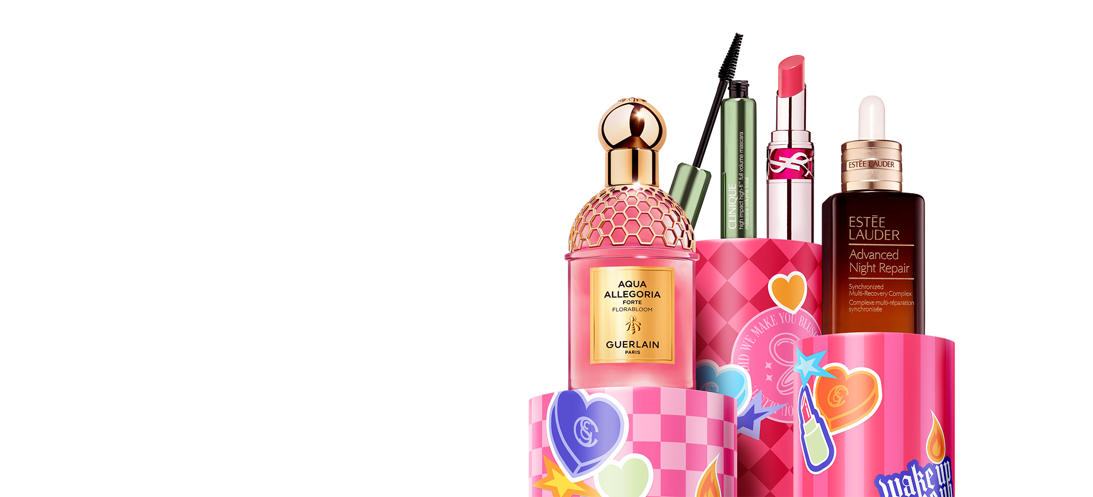
To support the two pillars of our Festival of Beauty campaign; the beauty discount itself and a gift with purchase, we developed two distinct hero graphics. This dual approach allowed us to remain flexible and responsive throughout the promotional period, especially as gifts are high-demand and often run out before the end of the promotion.
The discount-focused creative highlights the scope of our beauty offering, showcasing hero products from skincare, cosmetics, and fragrance across a curated mix of brands. This reinforces the depth and desirability of our beauty department while complementing the more playful gift-focused campaign.
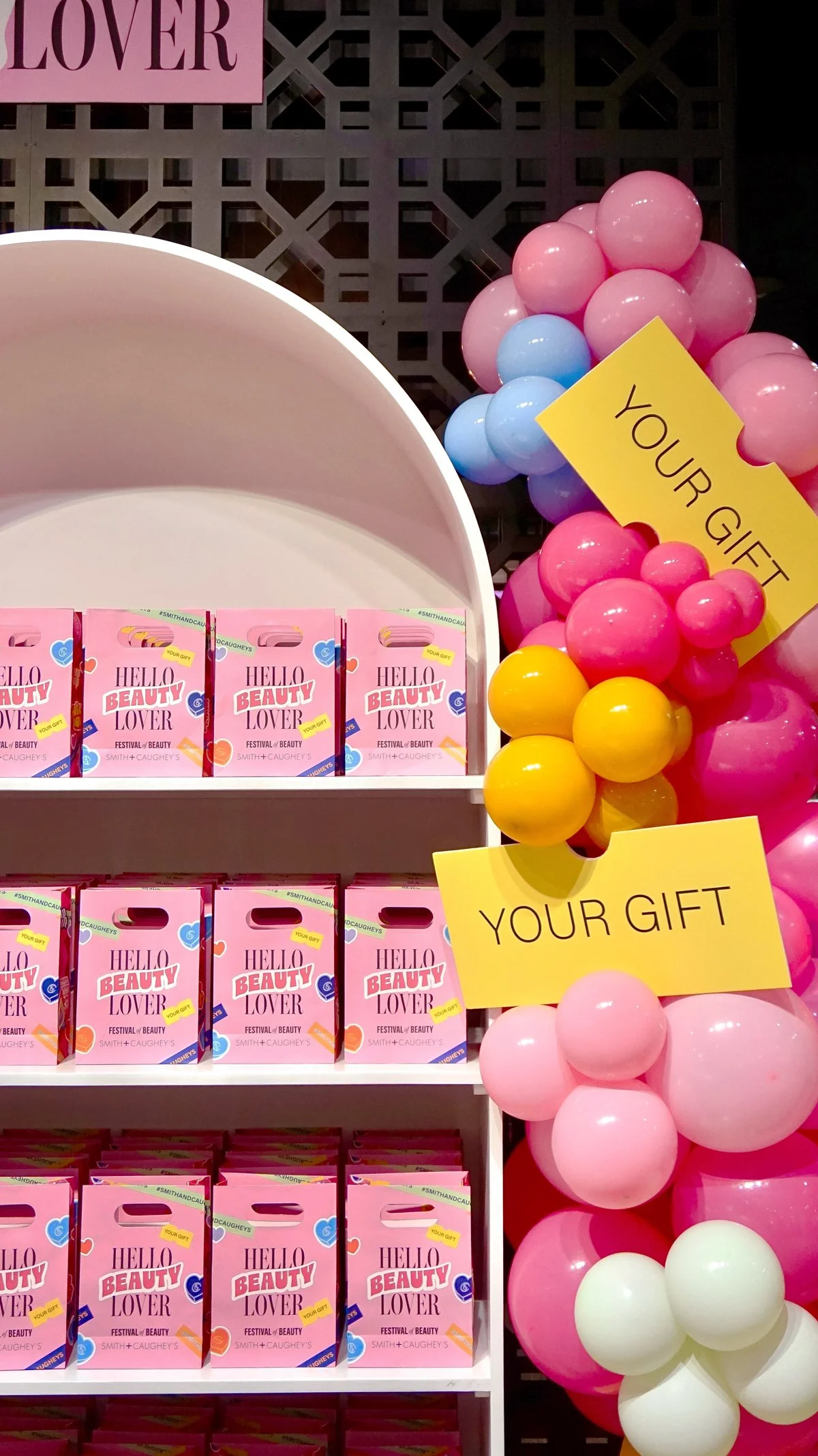
KEY GRAPHICSA central feature of Festival of Beauty is the gift with purchase bag, a key visual and physical touchpoint throughout the campaign. It serves as both a marketing icon for the incentive and a decorative emblem within the store. In many ways, it’s the unofficial mascot of the promotion.
This is one of my favourite pieces to design each year. I believe take-home elements deserve special care and attention as they linger with customers beyond their shopping experience, creating a lasting, tangible connection to both the promotion and our brand.
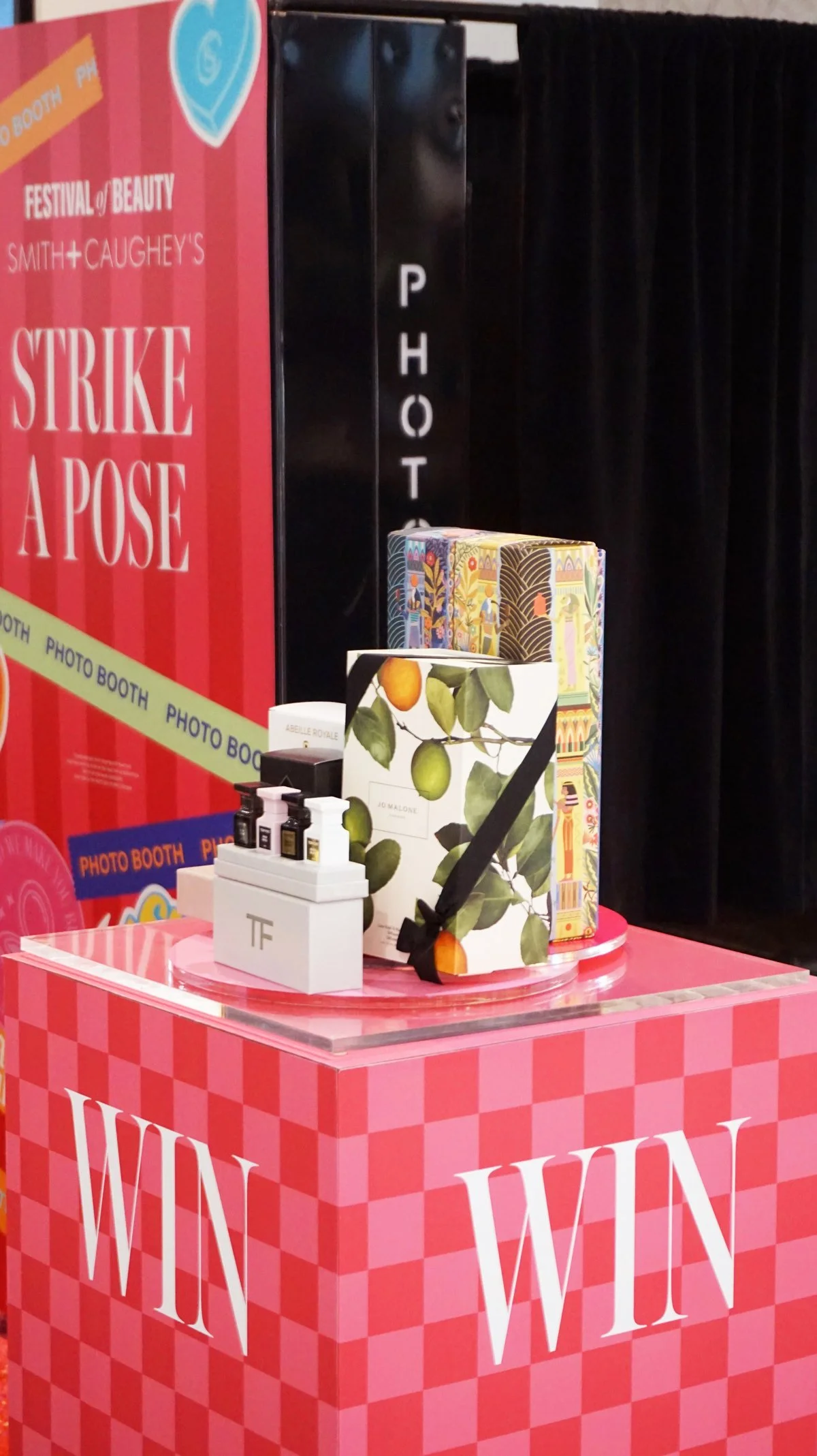
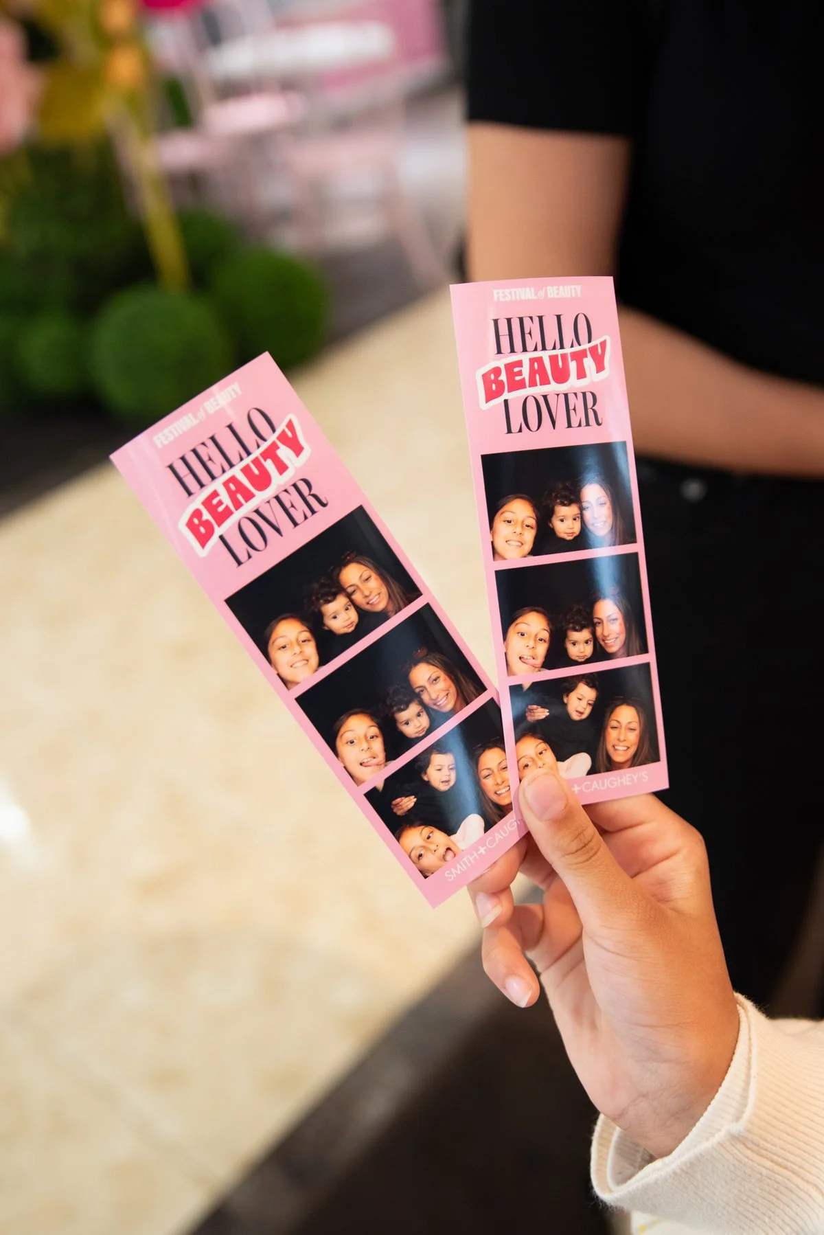
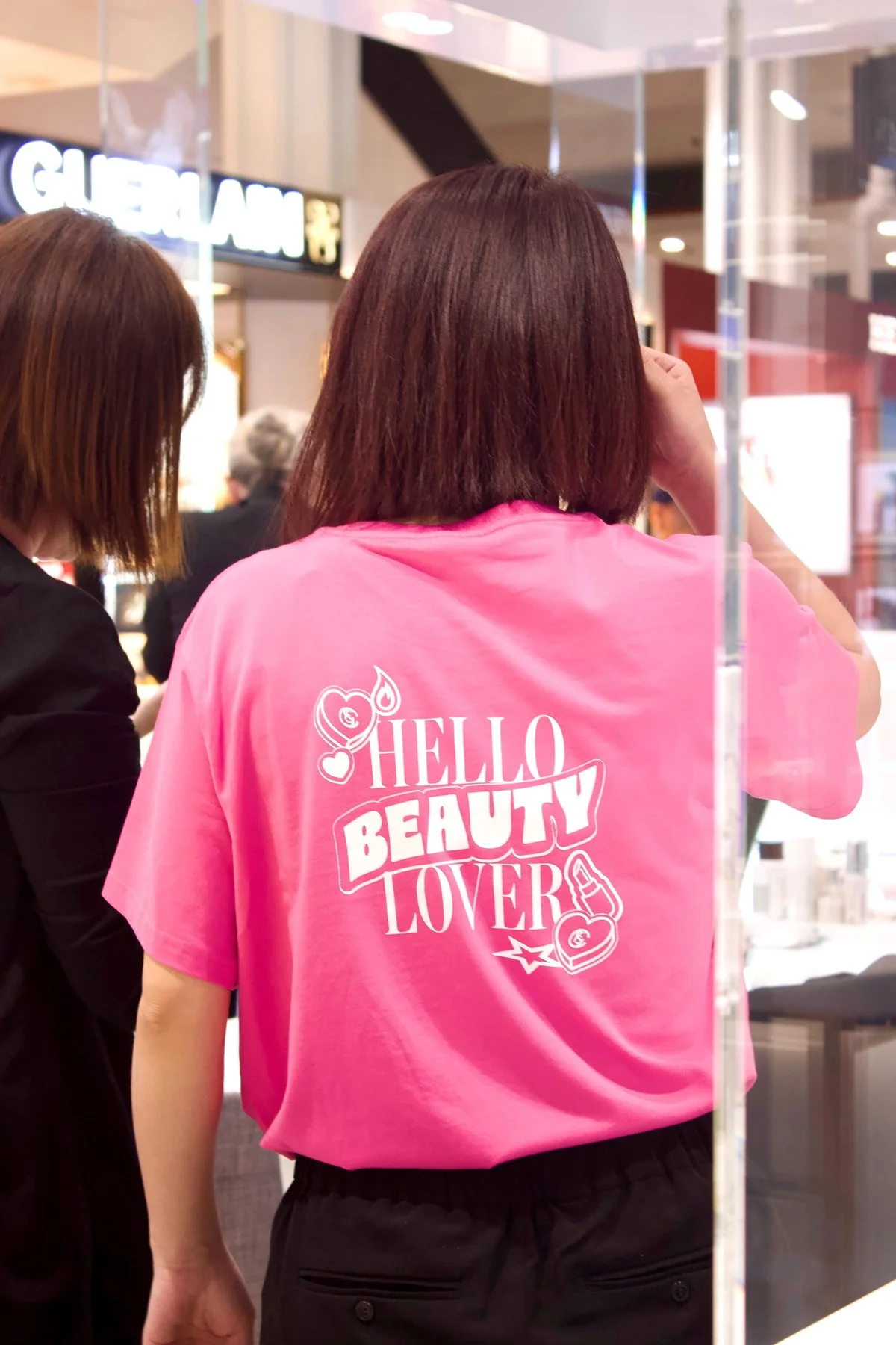
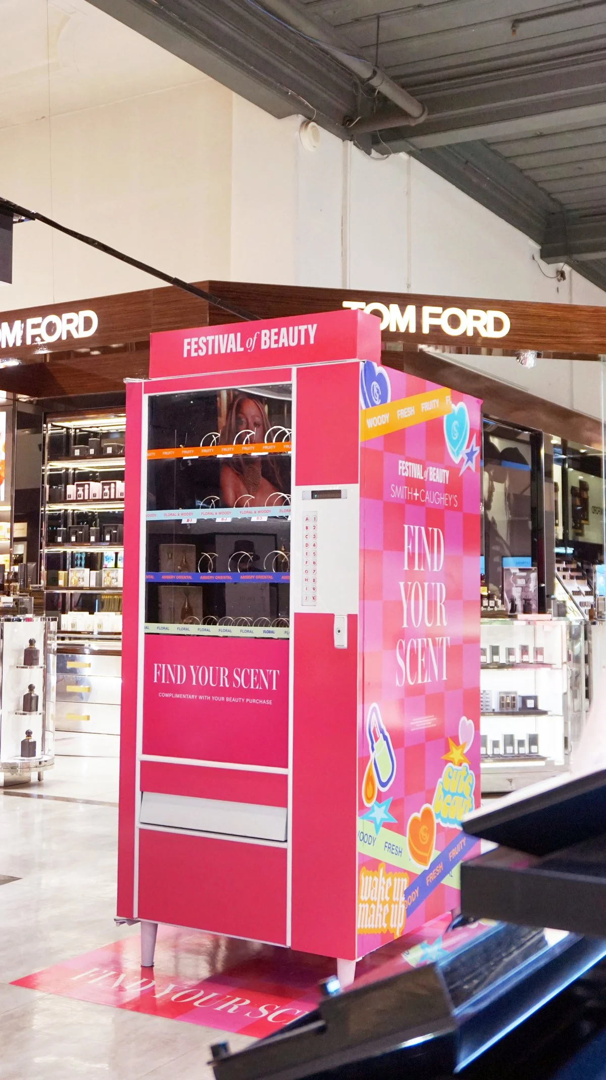
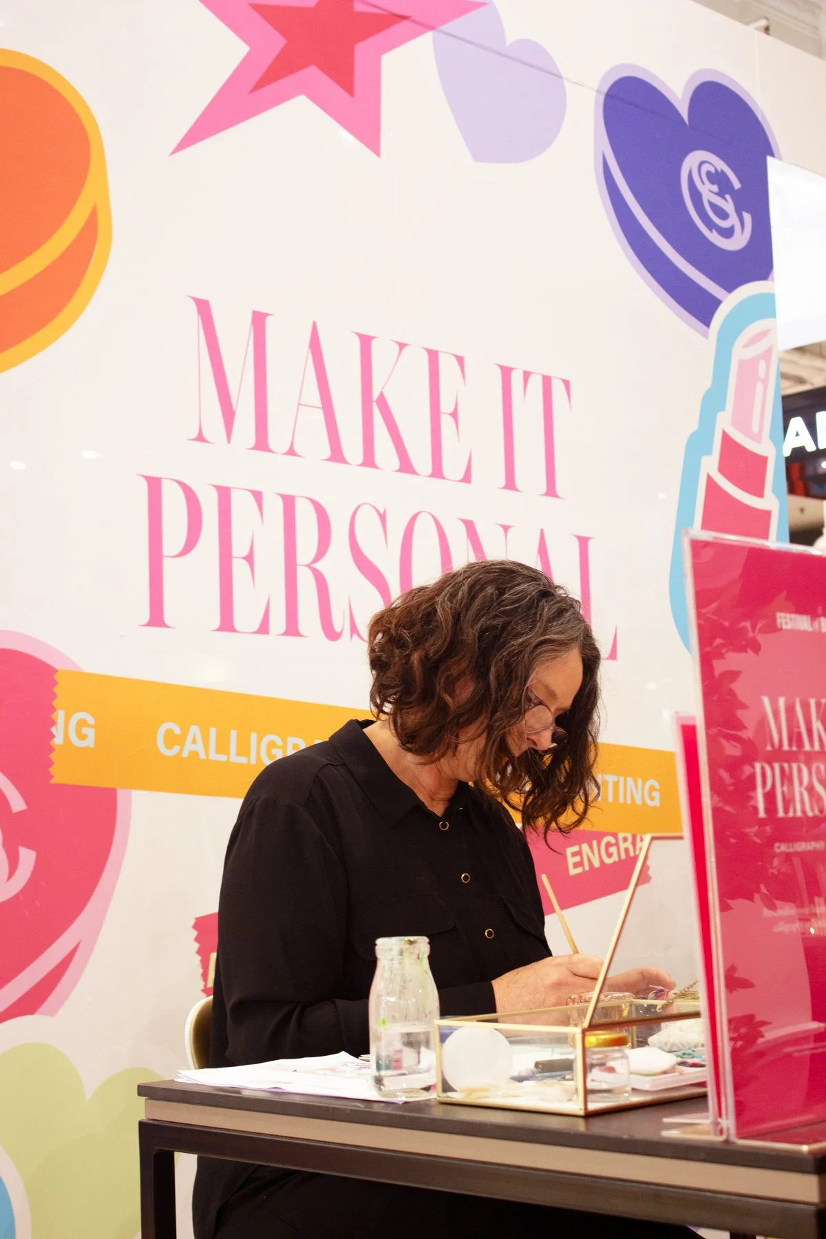
GIFT BAGThe Festival of Beauty experience extends well beyond traditional visual merchandising, with a series of vibrant in-store activations designed to delight and engage at every turn. From the photo booth to vending machine, personalisation station and the Smith & Coffees pop-up cafe, each activation carried its own unique personality while drawing from a consistent visual toolkit.
INSTORE GALLERY
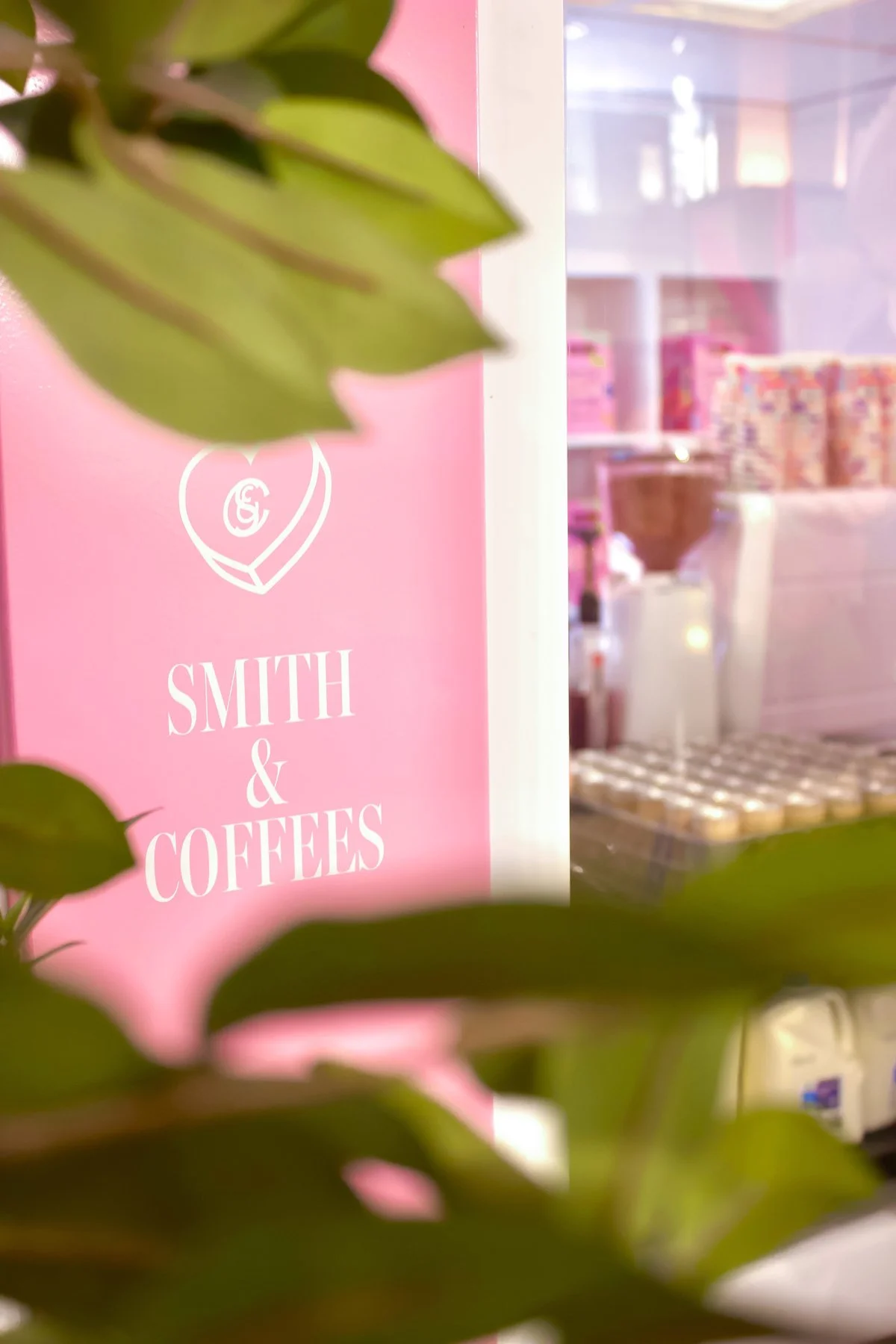

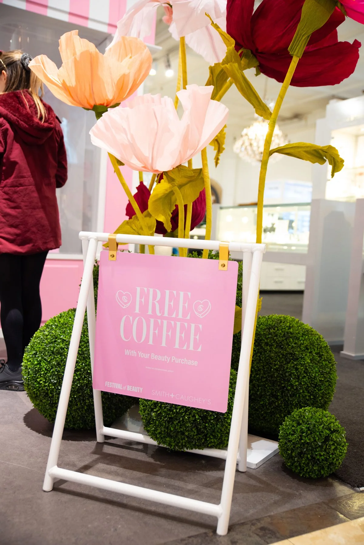

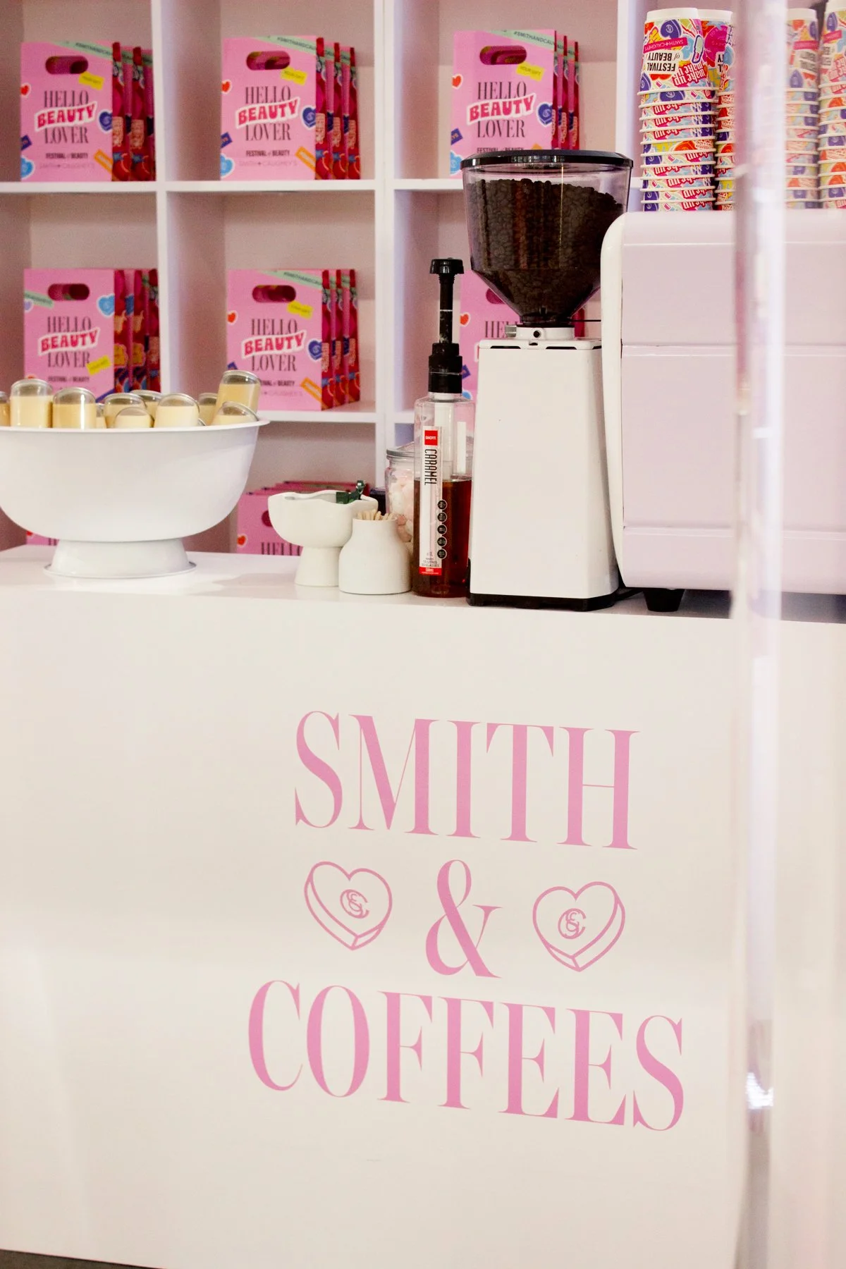
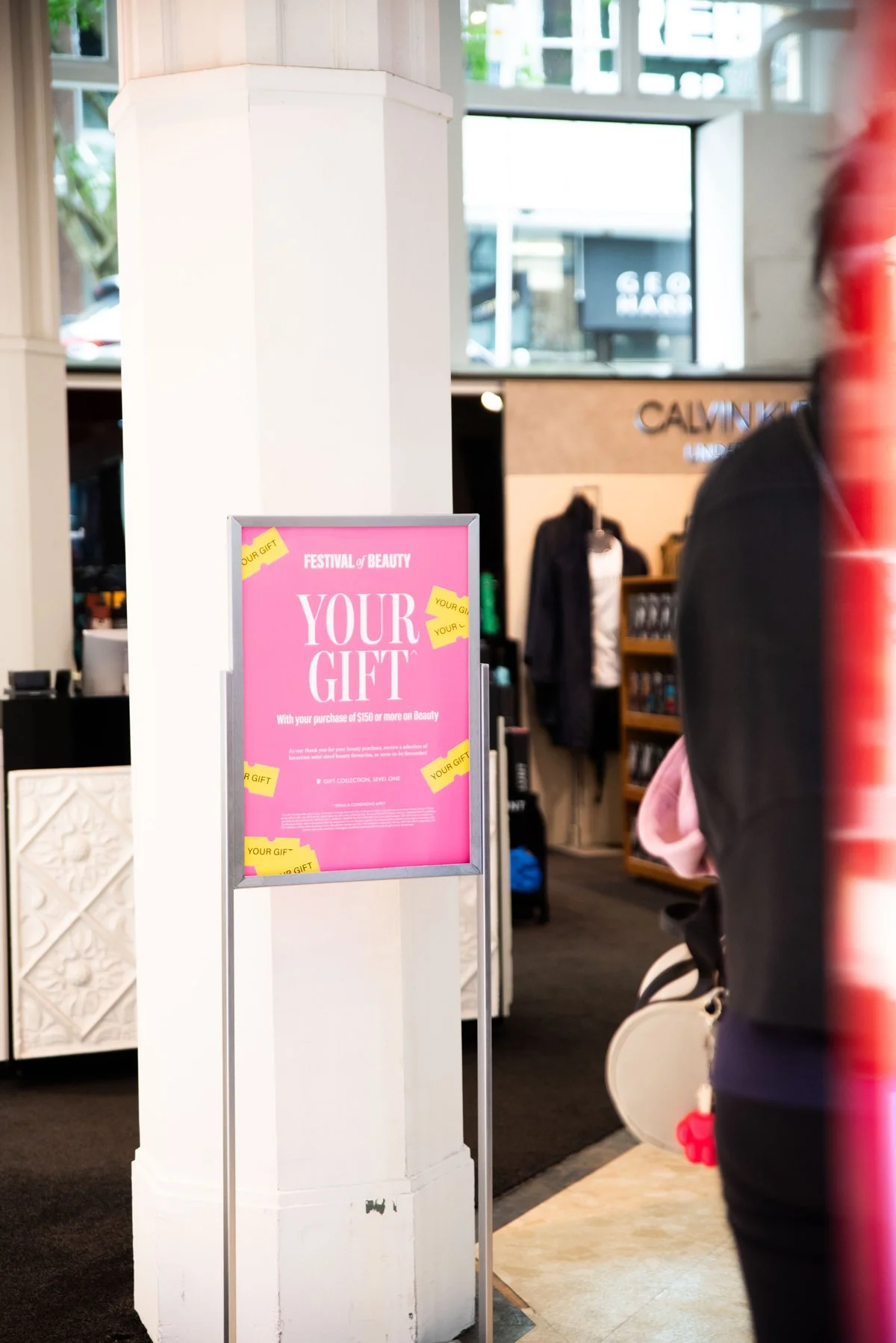


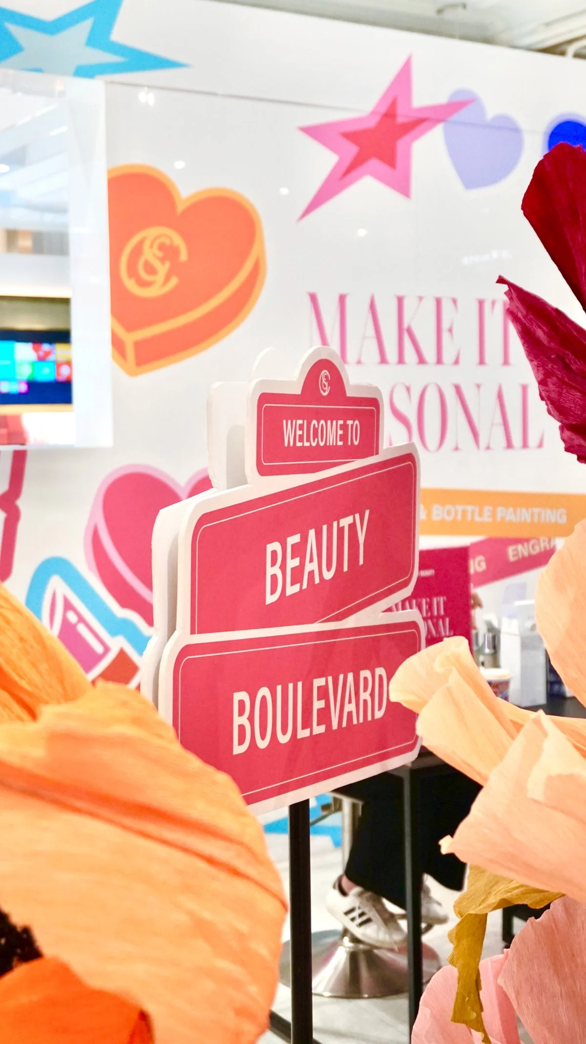
While the core campaign messaging centered on the discount and gift offers, there was a wider layer of supporting communication designed to build momentum across every touchpoint.
This included spotlighting hero brands to attract loyal audiences, surfacing key categories to guide discovery, and introducing value-based callouts like the Festival of Beauty To-Do List which highlighted the range of activations available, Free Parking, and Free Delivery incentives.
Together, these messages added texture and utility to the promotion, appearing consistently across email, website, social media, and in-store signage to reinforce the campaign narrative.
EXTRA MESSAGINGA collection of social clips captured throughout the activation, both in-store and behind the scenes, showcasing how the visual identity extended beyond static assets and into the lived customer experience. The footage highlights the campaign’s atmosphere, the retail environment, and the way customers and staff interacted with the creative system.
CREDITSFestival of Beauty Promotional Material and Advertising for Smith & Caughey’s, 2024.
Design and Art Direction Tash Coyle.
Instore Visual Merchandising Saimai Utto and team.
Instore Event and Activation Facilitation Lydia Dinkha.
Instore Photography Aki Curtis and Dominique Roebuck.
Campaign Photography Dominique Roebuck.
Video Content Dominique Roebuck.
Product Photography Brand Supplied.
Product Campaign and Lifestyle Photography Brand Supplied.
