
Smith & Caughey’s Rebrand
Concept
Refreshing the Smith & Caughey’s visual identity aimed to elevate the brand’s perception, reviving a time when a Smith & Caughey’s shopping bag symbolised status and aspiration.
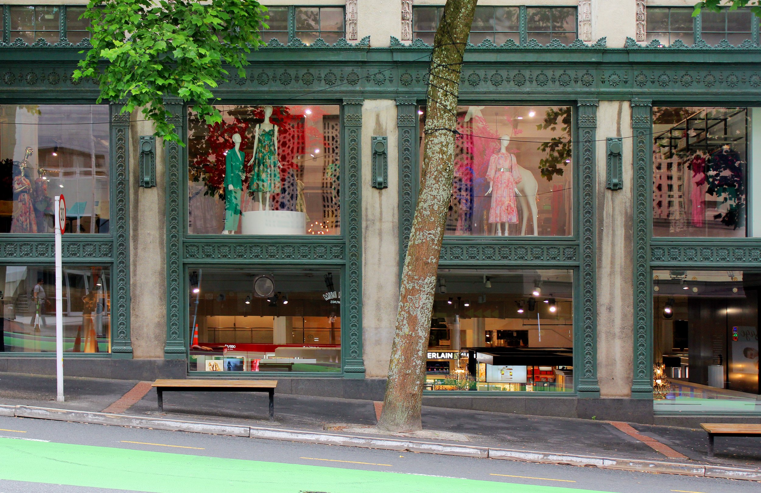
The direction centred on celebrating our rich history as a key point of difference, while championing the physical store to re-establish Smith & Caughey’s as an iconic Auckland shopping destination.
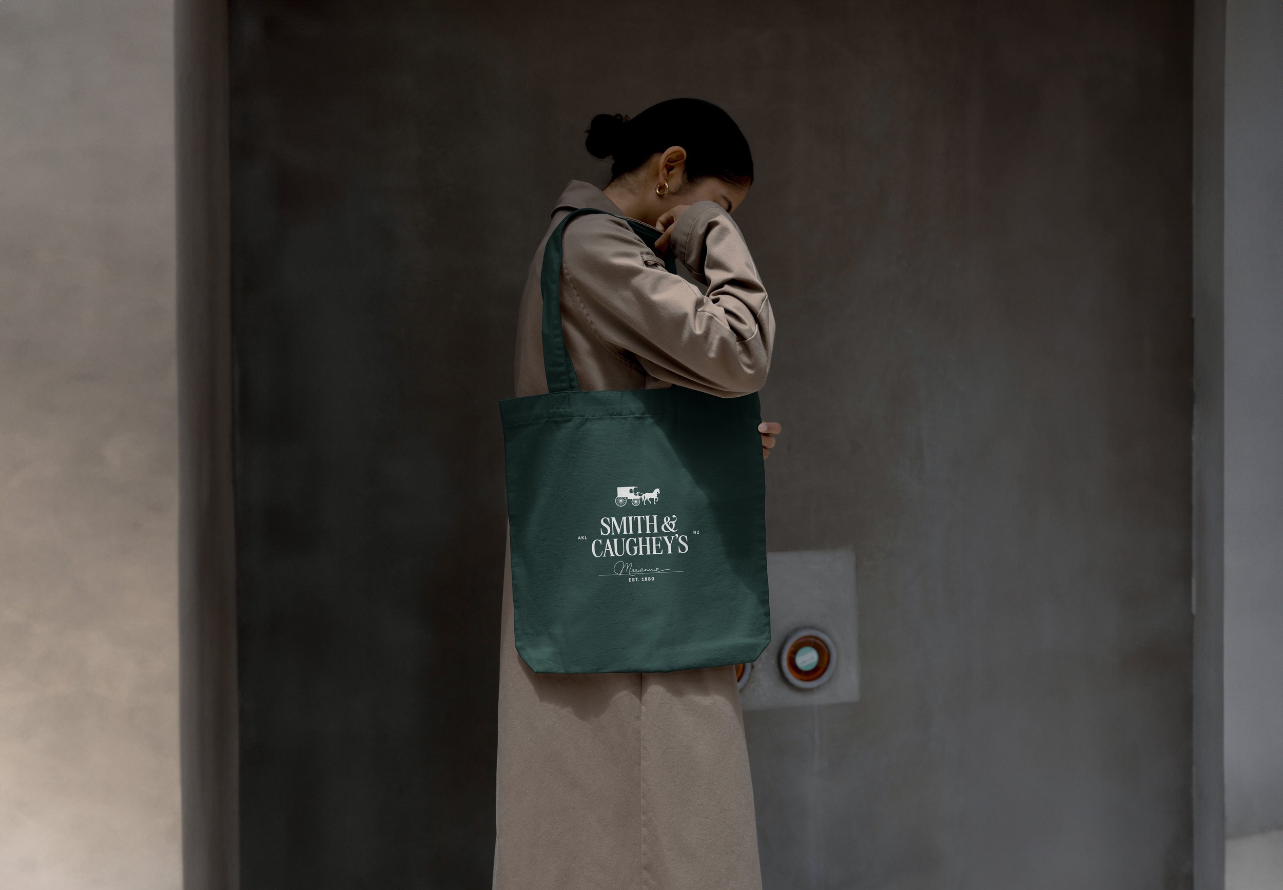
The brand name is reimagined using a modern interpretation of a traditional serif typeface, honouring Smith & Caughey’s heritage in a contemporary way, striking a constant balance between old and new. The familiar composition of the previous logo remains, preserving recognition.
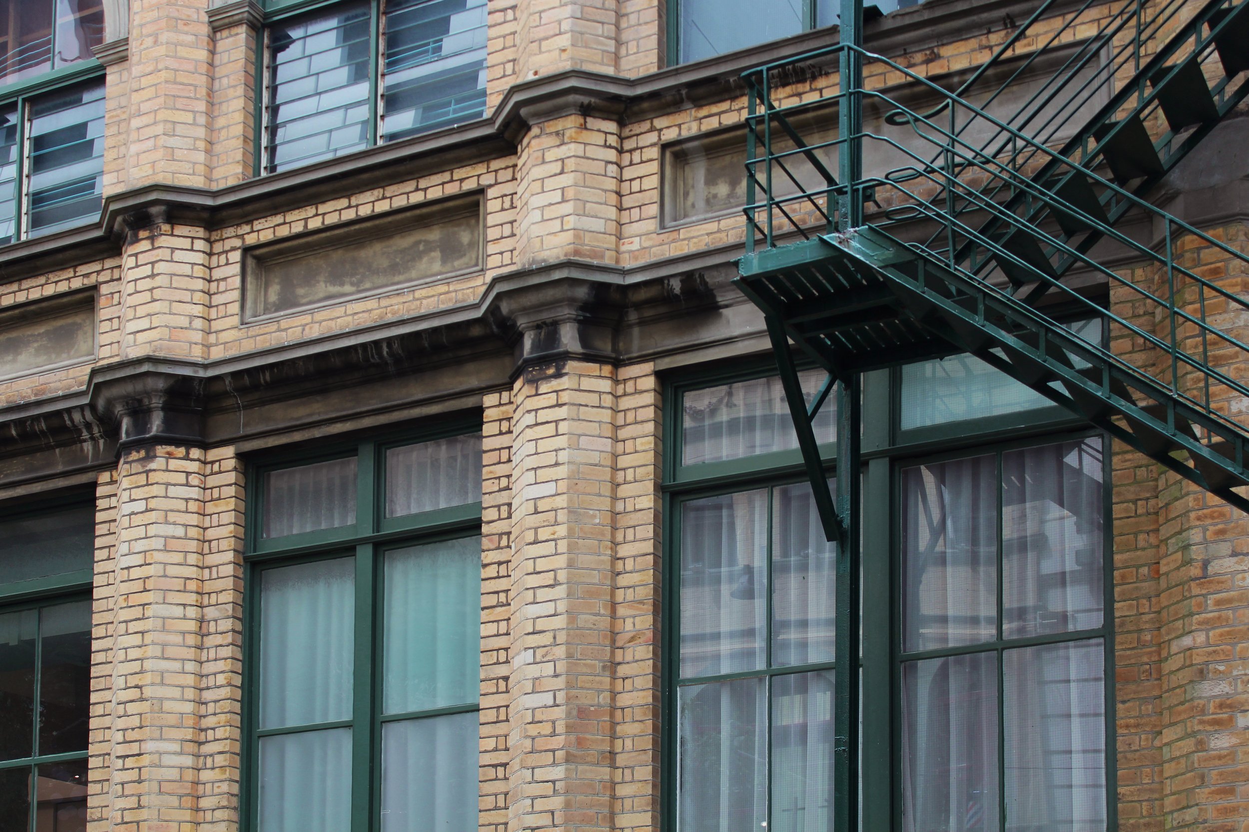
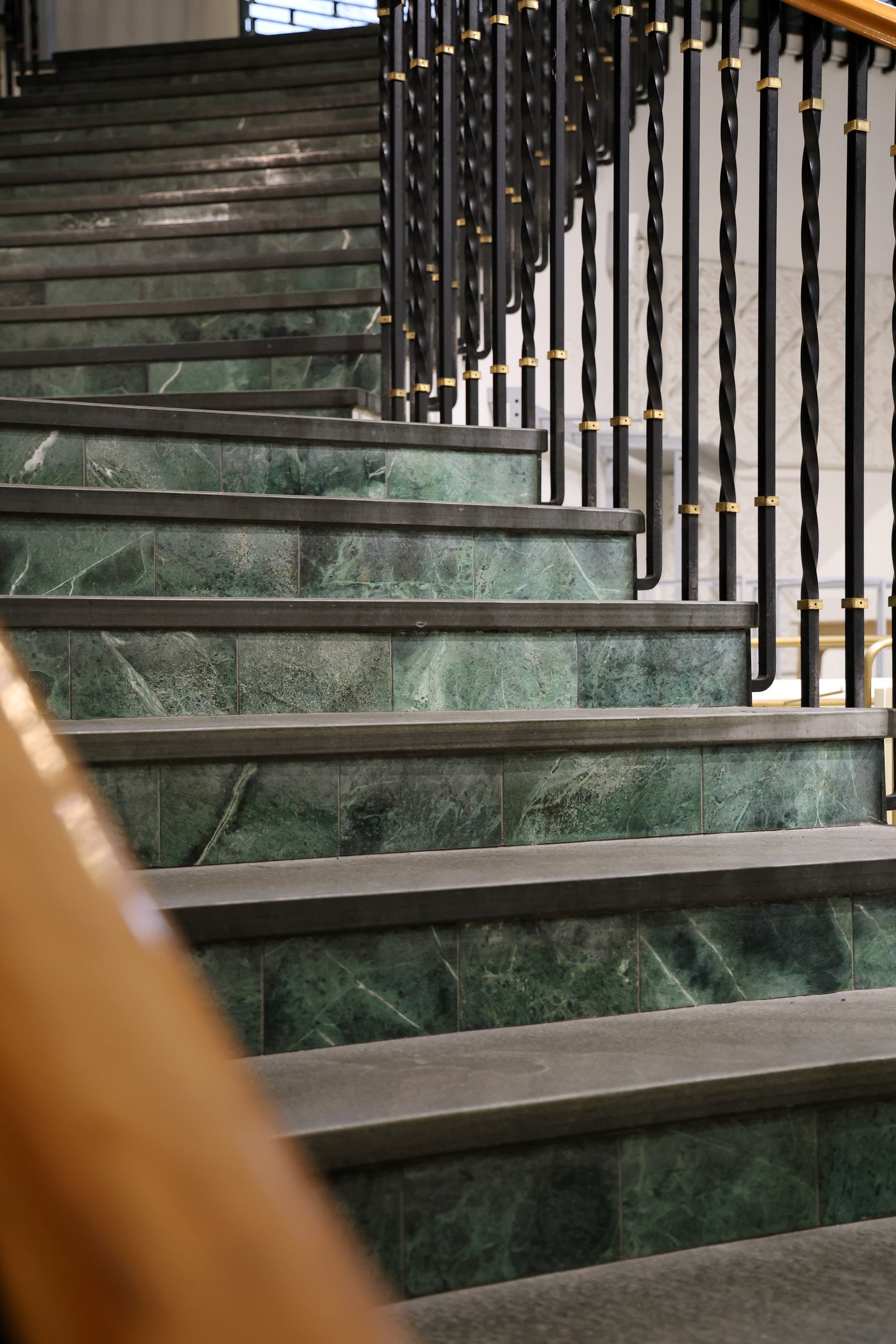
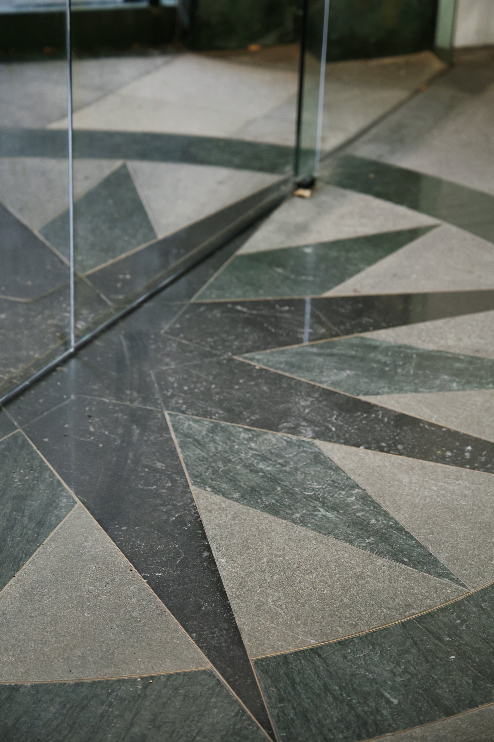
Green plays a prominent role in our Queen Street store, seen in the fire escape, ironwork, and marbled entryways. Elevating this colour in the branding underscores the value placed on our brick-and-mortar presence.


To enhance logo versatility, expanded variations are introduced alongside the primary mark. These include a horse and cart illustration, drawn from archival photos of our delivery service, and a version featuring the signature of founder Marianne Smith (nee Caughey).
Adding seamless patterns to the brand kit extends the reach of the Smith & Caughey’s identity. Designed for use in packaging, merchandise, and more, these graphics continue to draw inspiration from architectural details unique to the Queen Street store, reinforcing the importance of place.
STARBURSTInspired by decorative star motifs found at select store entrances.
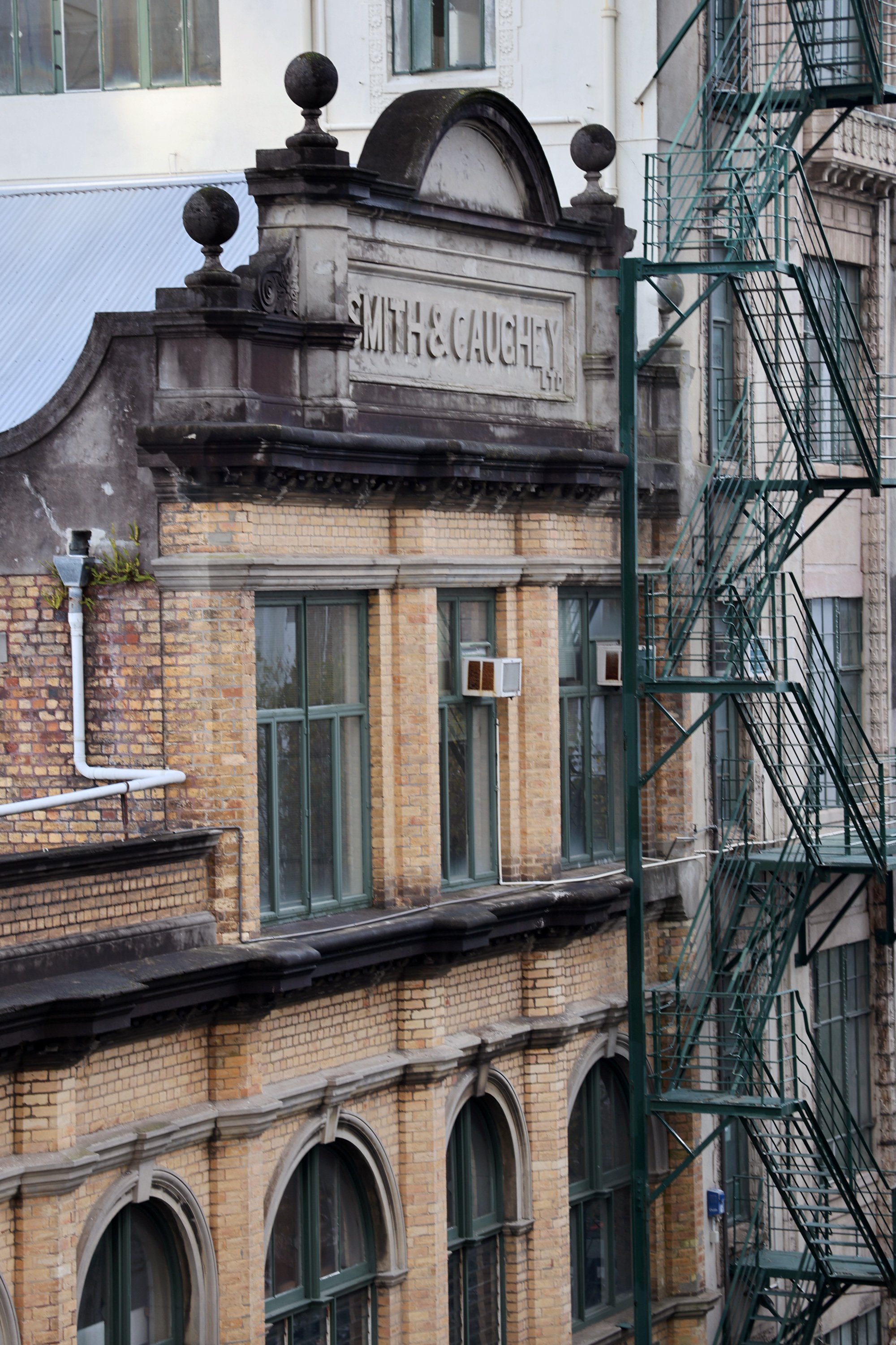
BUILDINGA nod to the beloved Elliott Street façade, characterised by arched windows, stacked symmetry, and the iconic fire escape.
CREDITSDesign Tash Coyle.
Mockups Multiple Sources.
Rebrand Concept for Smith & Caughey’s, 2023.