
Spatial Awareness
Branding
Spatial Awareness is a young visual effects studio seeking to establish itself as confident, professional, and reliable within a highly competitive industry. The challenge was to create a brand identity that felt considered and credible, without mirroring the visual language of established competitors.
The resulting system balances restraint with flexibility. A clean, pared-back core identity allows the brand to translate seamlessly across professional and studio-facing contexts, while expressive graphic elements can be layered in to introduce energy, personality, and creative edge.

Cinematic
Controlled
Confident
KEY BRAND PERSONALITYThese qualities informed how the brand behaves across different contexts.
Given the imaginative nature of VFX, the identity needed room to express energy and personality across storytelling and internal culture, without compromising credibility. This led to a visual language designed to expand or contract depending on context.
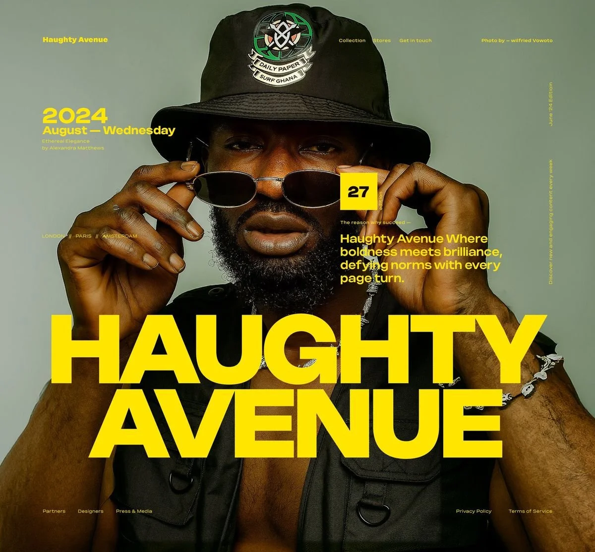
INSPIRATION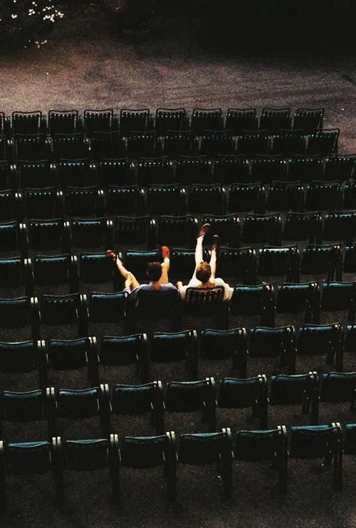


The logo was designed with a strong sense of visual balance and spatial logic. Proportion, spacing, and weight were carefully considered to reflect the studio’s name and craft.
It performs confidently in restrained contexts, while remaining flexible enough to support animation, scale, and expressive applications.
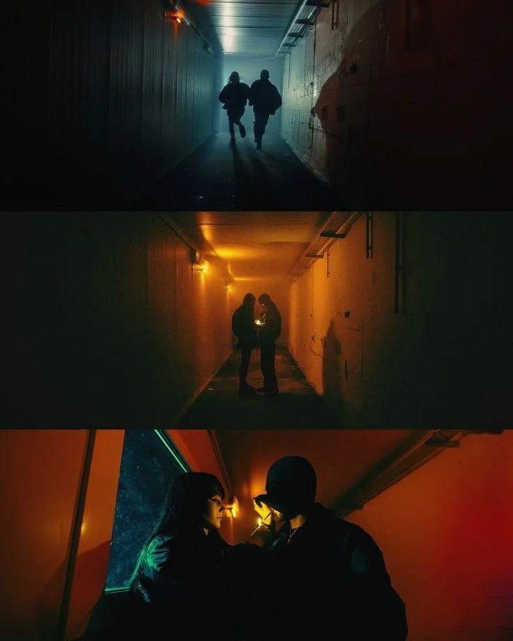
LOGOThe colour palette is inspired by cinematic lighting and film stills, drawing from deep shadows, warm highlights and moments of high contrast. Used selectively, colour helps establish mood and atmosphere while supporting both subdued and expressive brand moments.
COLOURThe pattern system is derived from the logo’s core forms, translating the primary rectangle and secondary square into structured, geometric compositions that add rhythm without overpowering the identity.
PATTERNSThe typographic system draws directly from cinematic and blockbuster film references. Bold, condensed headline styles echo the scale and drama of movie posters, while more traditional body typography grounds the system in clarity and professionalism. This balance allows type to feel authoritative and cinematic without becoming theatrical, supporting both information-led and expressive brand moments.
TYPEWhile the initial brief leaned toward a restrained, highly polished identity to signal industry credibility, I identified an opportunity to build a system that could flex further, without undermining professionalism.
In an industry driven by imagination, culture becomes a defining force. These concepts explore how the brand identity can open up, allowing energy, experimentation, and personality to surface across campaigns, internal culture, and marketing-led moments.
CAMPAIGN & MARKETING CONCEPTSINFLATED BRAND NAMEThe inflated logo animation plays on the literal idea of spatial awareness, expanding to occupy its environment before returning to its original form. The treatment turns the brand name into a spatial object, showcasing the studio’s VFX capability in a way that feels confident and recognisable.
Designed to work across motion and static applications, the concept extends from animated end frames and digital touchpoints to print and apparel, reinforcing brand recognition through form and movement.
This concept explores the intersection of advanced visual effects and tactile, analogue references. Drawing on familiar technology and physical media, it introduces warmth and cultural resonance into an otherwise technical space.
The approach demonstrates how the brand can humanise complex work, using memory, texture, and materiality to build emotional connection while maintaining technical credibility.
LEVERAGING TECH NOSTALGIAApparel was approached as an extension of the brand rather than merchandise for its own sake. The system supports both refined, logo-only pieces for team use and more expressive items intended for on-set or off-duty wear. This allows the brand to build presence in a quieter, lifestyle-driven way.
Utility-led applications focus on clarity, durability, and ease of recognition across everyday studio and professional contexts. These pieces are designed to function practically across equipment, documentation, and gifting materials, allowing the brand to integrate naturally into how the studio operates.
By embedding the identity into functional tools and touchpoints, Spatial Awareness maintains a consistent presence across both production and client-facing environments, reinforcing familiarity and credibility over time.
The result is a brand system built to support both serious production work and the creative energy behind it.
CREDITSDesign Tash Coyle.
Mockups Mockup Maison, Adobe Stock and Made By Attic.
Select imagery used for illustrative and conceptual purposes.
Branding for Spatial Awareness, 2025.