
Cool Fridge
Micro-Brand Personal Project
Cool Fridge began as a craft-project hyperfixation: while making a batch of handmade clay fridge magnets as Christmas gifts for my family, I suddenly had around fifty left over. Friends told me they’d happily pay for them, so to keep things simple, I set up a private Instagram account and offered the extras to a small, selected group. What followed was an unexpected wave of hype, competition, and obsession.
Across two drops, this tiny project behaved like a full micro-brand, complete with visual identity, product photography, teaser content, limited releases, and a community that treated each magnet like a collectible. Cool Fridge became a design experiment that blended craft, scarcity, humour, and social behaviour, showing how quickly a considered brand world can take on a life of its own.
PART ONE
THE ORIGINAL DROP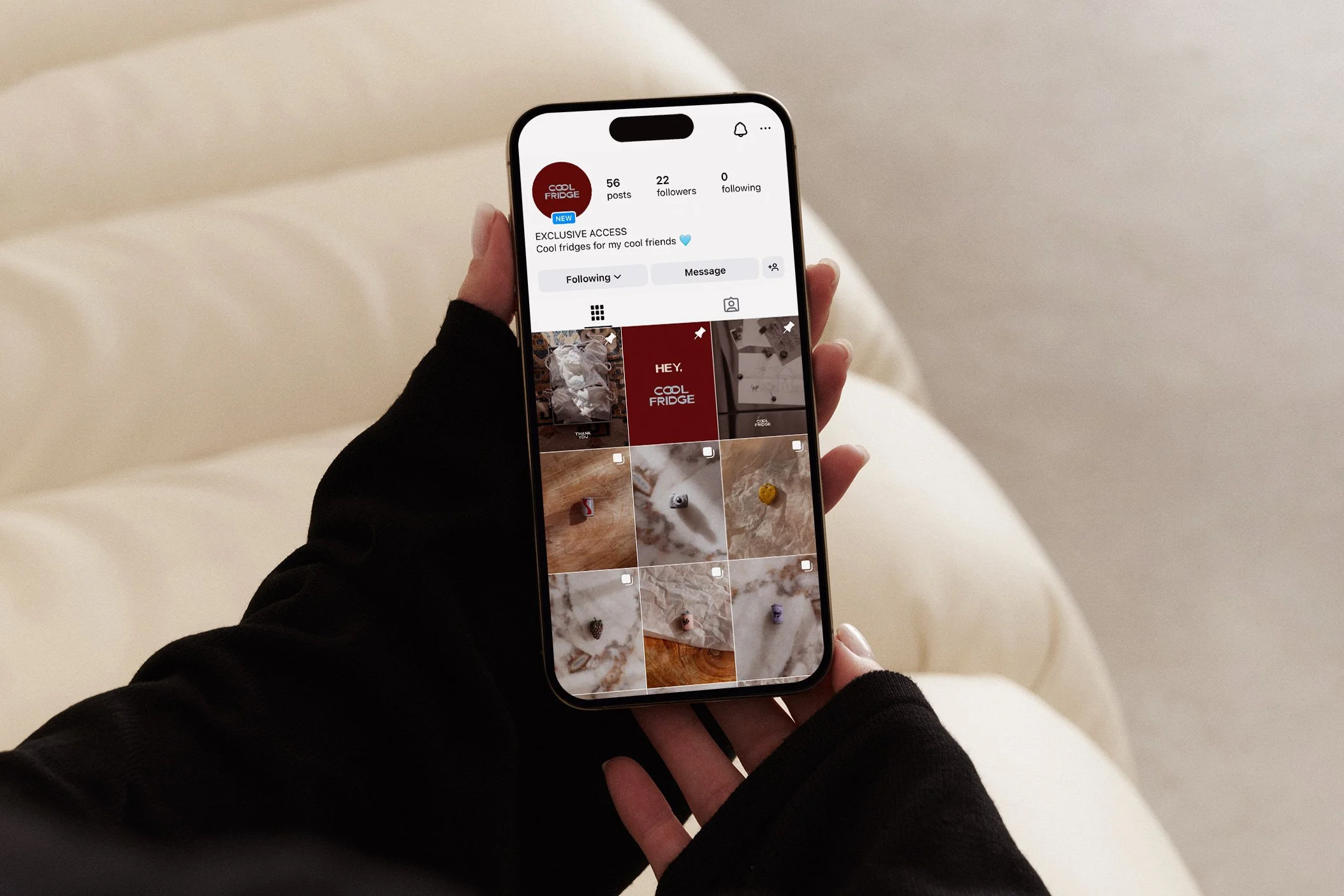
45 of 50 sold in 24 hours
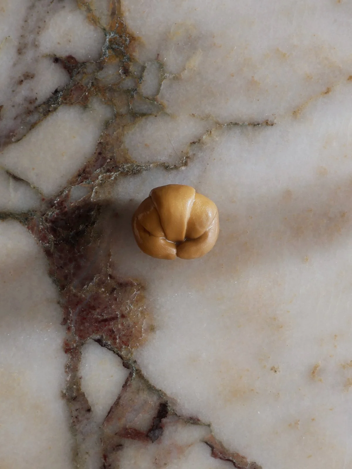
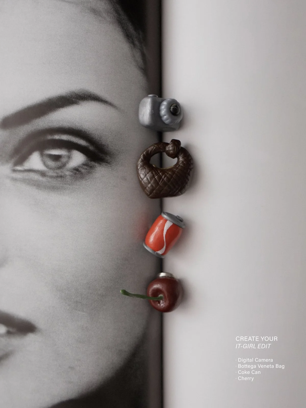
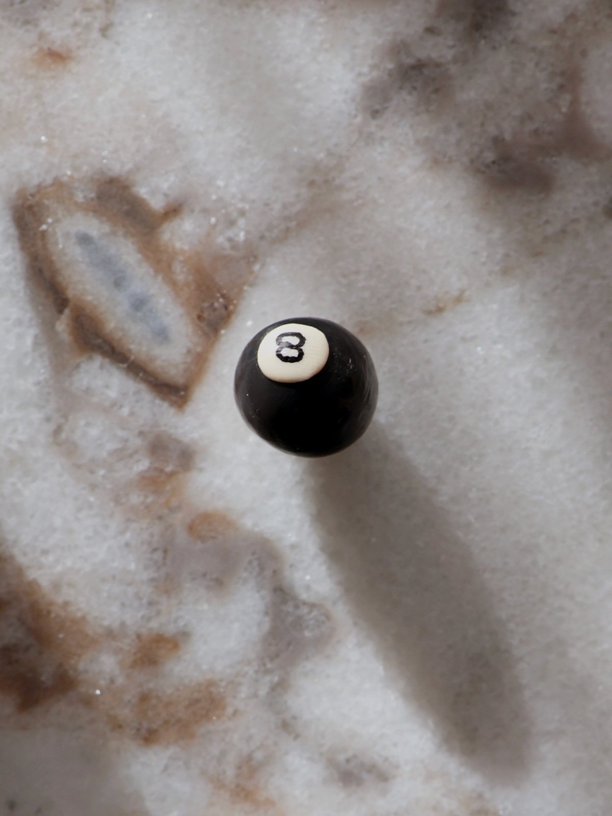
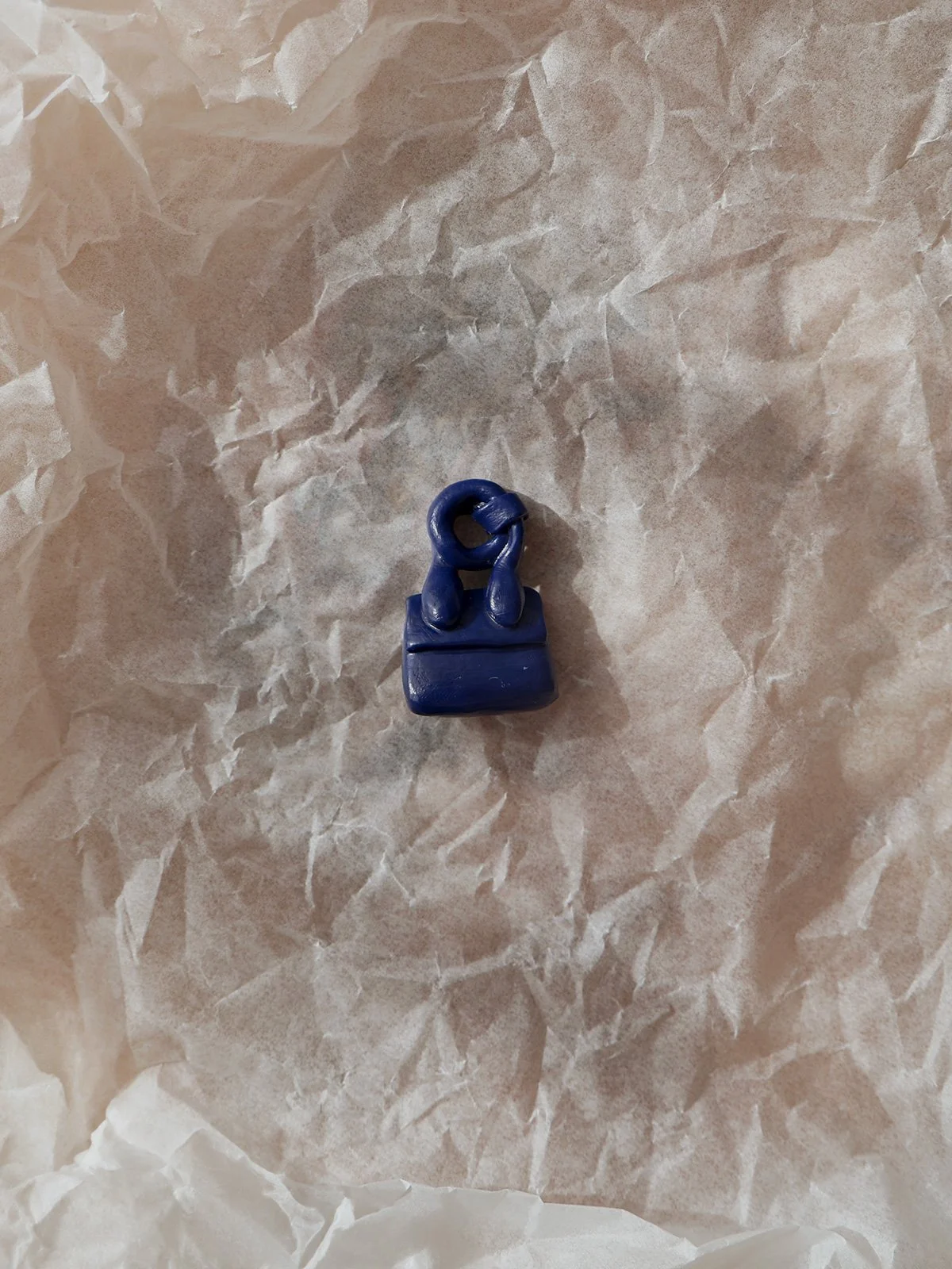
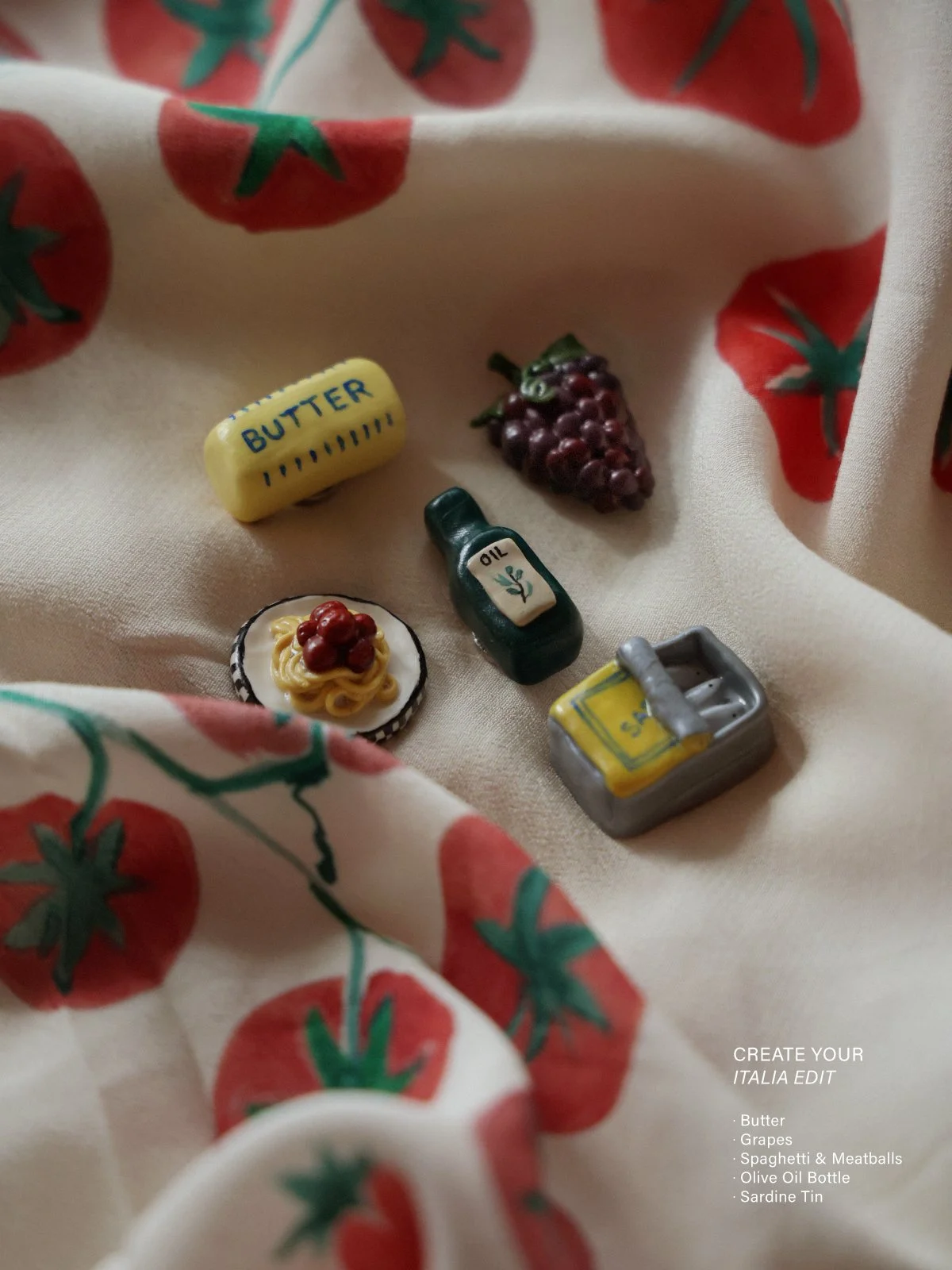
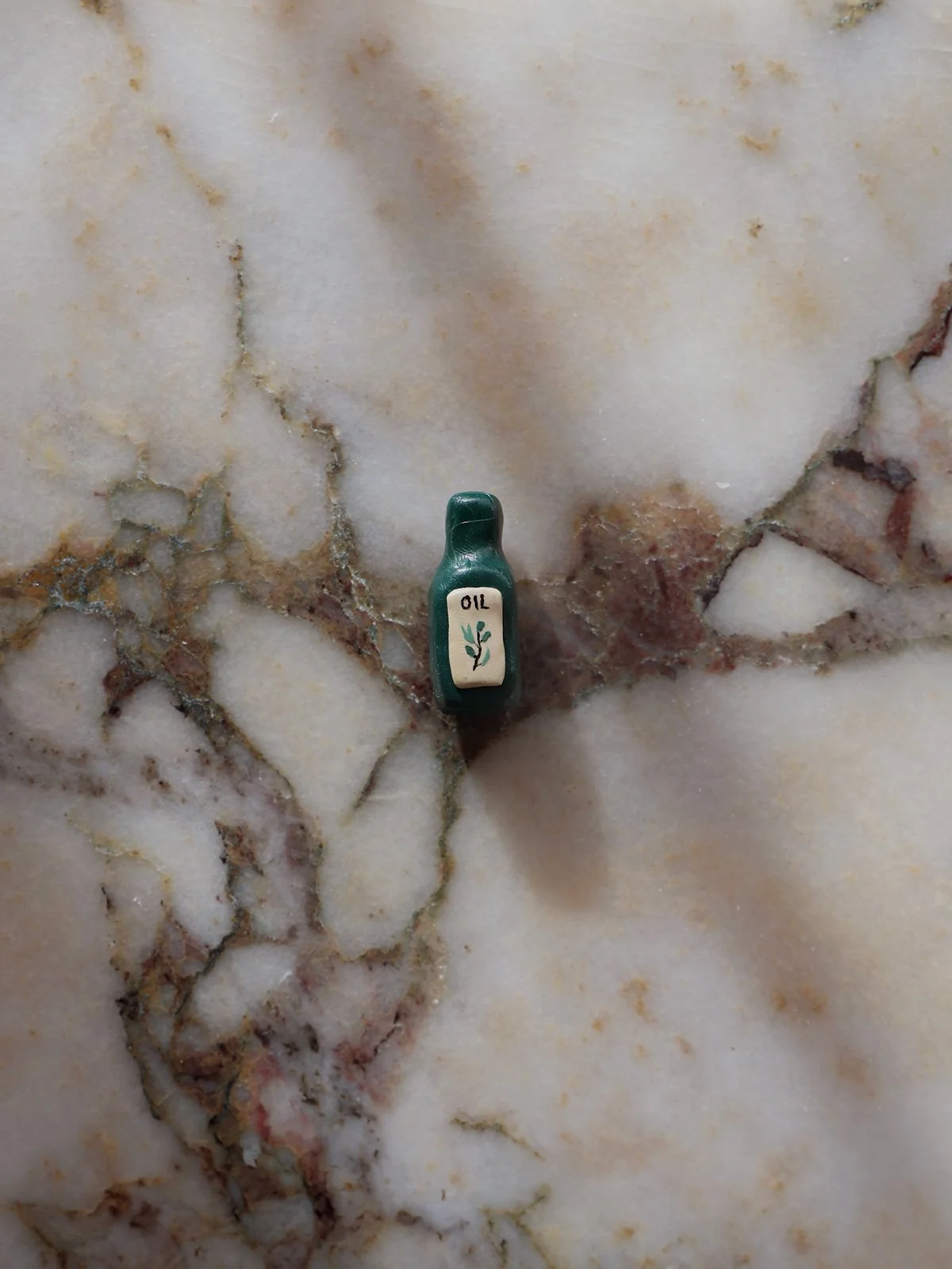
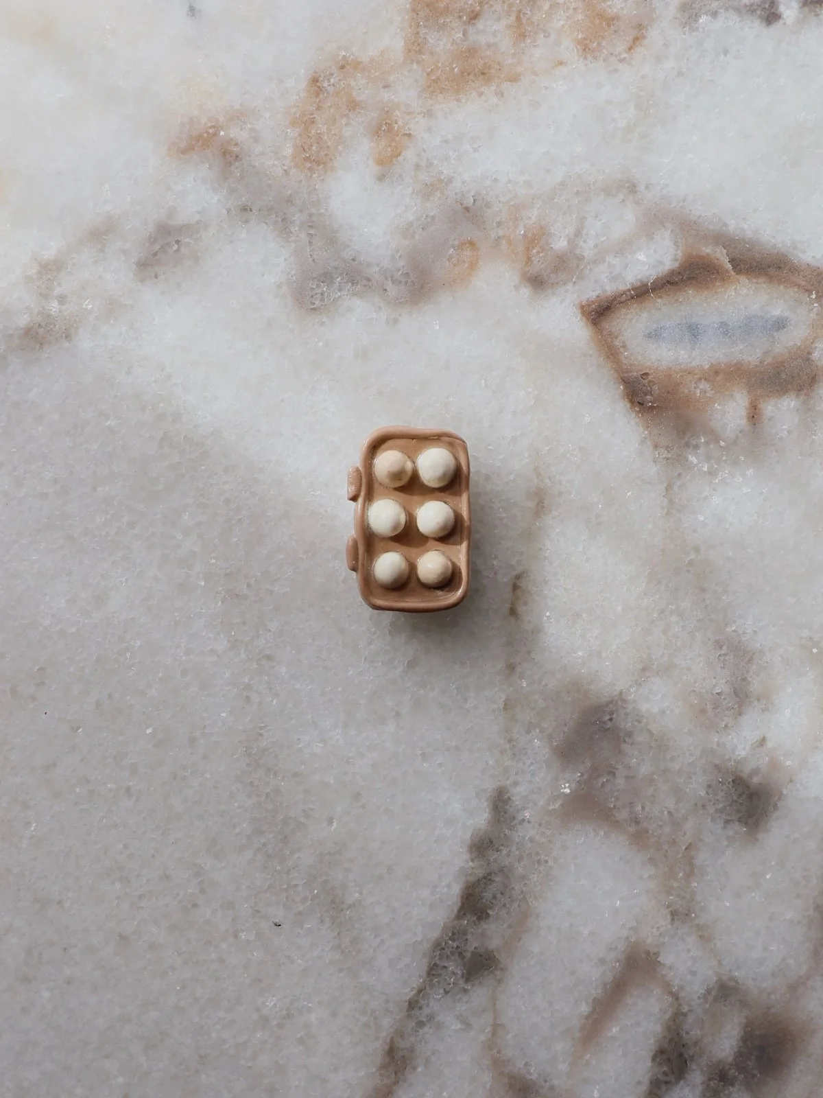
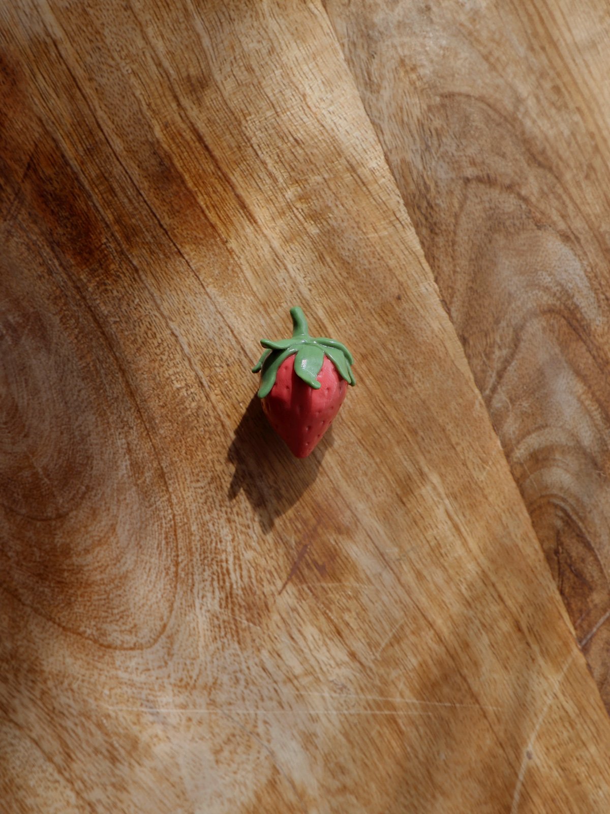
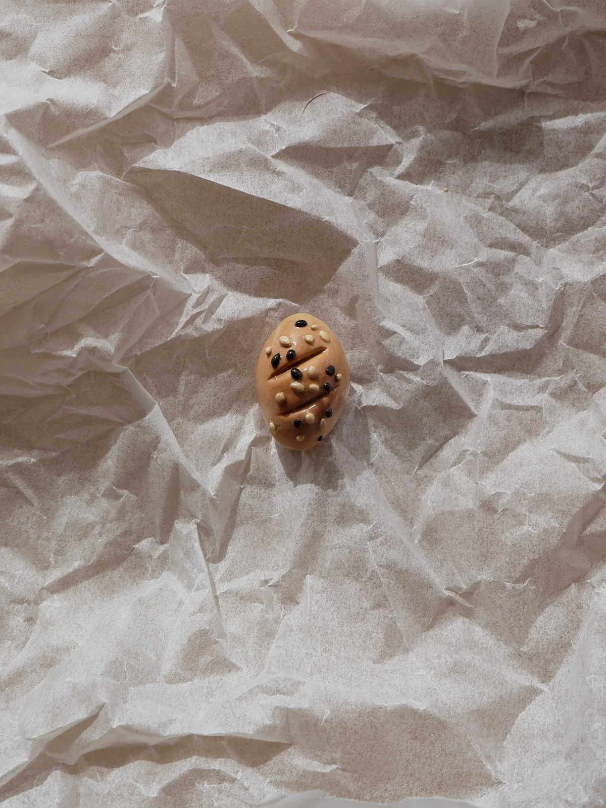
Part One centred on the original batch of fifty magnets. I photographed each one individually in a consistent flatlay style: centred, small-scale, and shot against warm, domestic textures to build a simple but cohesive visual world.
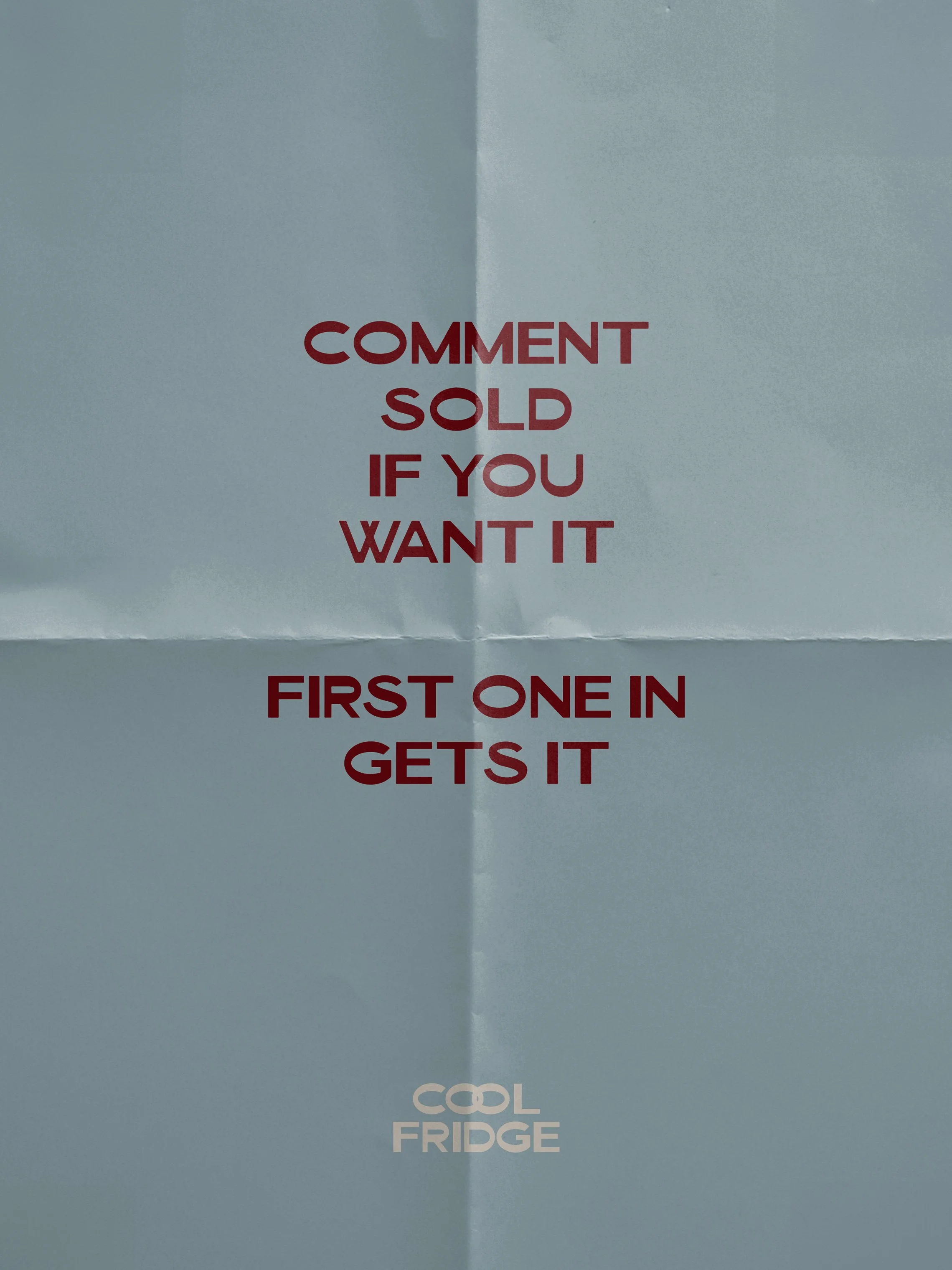
The audience for this drop was intentionally tiny. Twenty-three close friends opted in to follow the private Instagram account, after twenty-six friends were invited via a Close Friends story on my personal account explaining the process. With no promotion beyond this closed circle, the magnets still sold with surprising speed; fourty-five of the fifty were claimed within twenty-four hours. What emerged was a wave of enthusiasm, competitiveness, and emotional investment, with friends racing to comment “sold” and sending increasingly dramatic messages when they missed out.
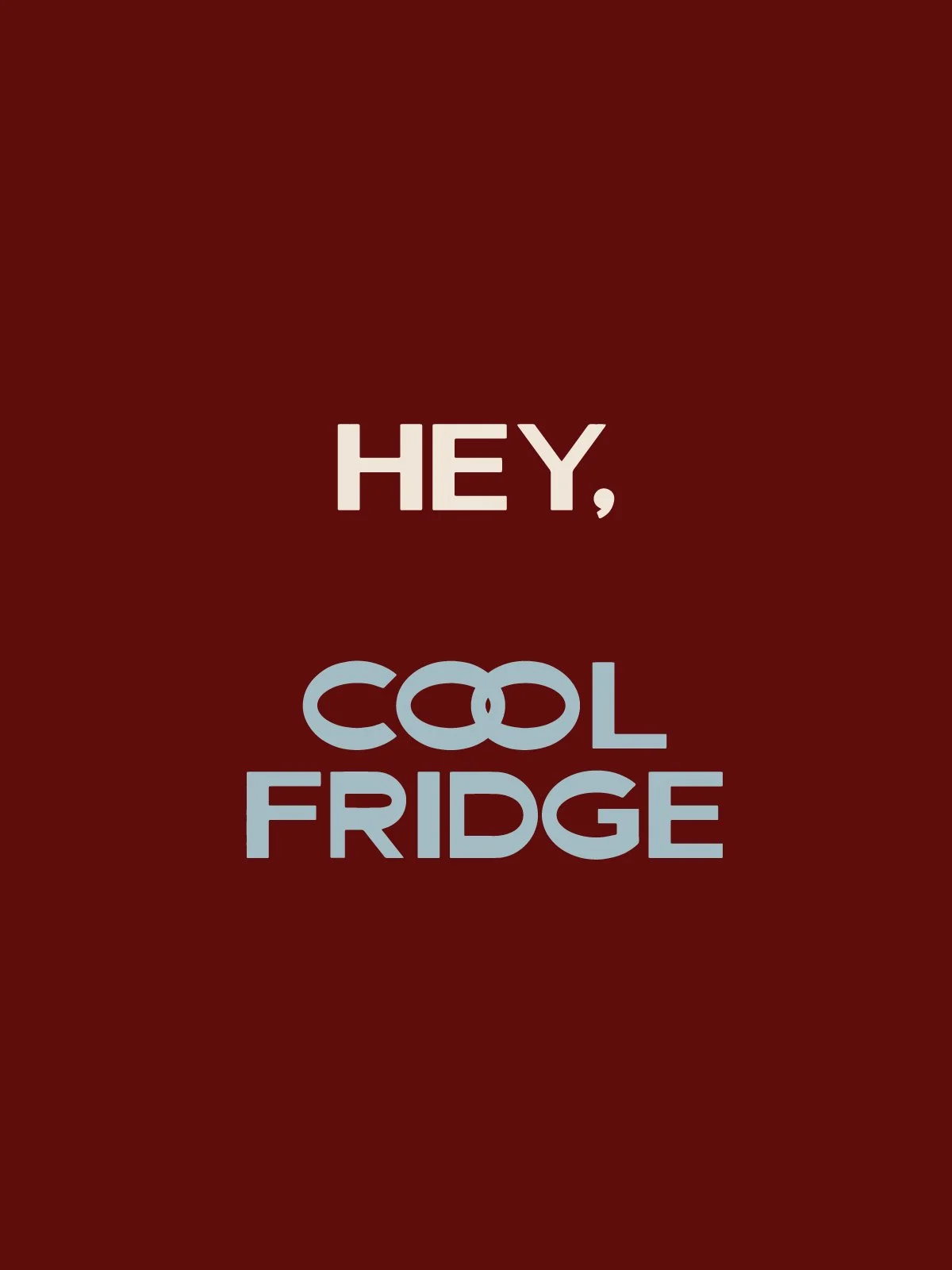
Part One revealed the foundation of Cool Fridge, a handmade craft project made cohesive through tone, imagery and constraints, and fuelled by a level of engagement I hadn’t anticipated. This early world-building included the beginnings of a visual identity and a handful of “campaign-style” lifestyle images, which helped the project feel more like a tiny, intentional micro-brand than a casual craft experiment.


PART TWO
RESPONSE TO DEMAND
23 of 24 sold in 1 hour
The second drop began in response to the unexpected intensity of the first. Friends who missed out asked for another chance, and several sent increasingly passionate messages requesting previews, custom pieces, or “dibs” on specific magnets. To make the next release feel fair, I introduced a more structured system for Round Two.
All followers were removed from the private Instagram account, and anyone who wanted access had to actively re-request to follow. This reset narrowed the audience to sixteen returning followers (70% retention), a smaller but far more engaged group. In the days leading up to the release, I pre-loaded every magnet post to keep the grid consistent and calm, then accepted all follow requests simultaneously at 7pm on drop night to give everyone an equal starting point.
The second release was smaller due to limited materials and craft supplies. Despite the reduced inventory and audience size, Round Two sold out at an even faster pace: twenty-three of the twenty-four magnets were claimed within the first hour. The enthusiasm was heightened, with friends setting alarms for the 7pm drop, strategising, sending frantic DMs, and, in one case, asking for my craft supply list so they could attempt to recreate a magnet they’d missed.
Part Two showed that Cool Fridge wasn’t a one-off moment, it had become a tiny brand ecosystem driven by tone, scarcity, visual consistency, and the behaviour of a highly invested audience.

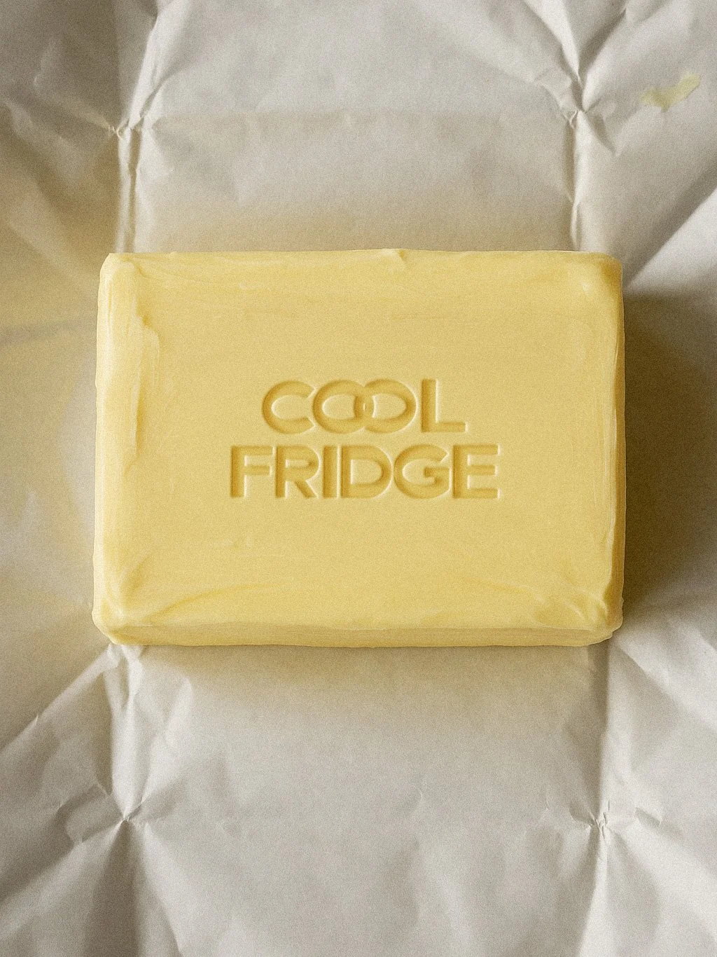


Cool Fridge didn’t have a full identity system, but it still operated within a deliberately shaped brand world. The name itself did half the work; Cool Fridge and the handle @heycoolfridge played into the humour, trendiness and “cool by association” energy the project tapped into. The palette of cool blue, rich burgundy and off-white, was chosen for its subtly fridge-adjacent temperature without being literal, and because it felt current, fitting for a project that existed in a fleeting, trend-based moment.
BRAND & ART DIRECTIONThe visual language stayed intentionally simple: centred flatlays of the magnets at a consistent scale, photographed against warm domestic textures to create a tiny collectible universe. Graphic tiles used folded-paper textures as a nod to notes stuck on a fridge, while teaser images in warm, grainy black-and-white added mood and let me obscure details between drops. Typography and colour remained consistent across the grid, giving the feed cohesion without over-structuring what was ultimately a spontaneous hyperfixation project.
Together, these elements created a small but distinct brand world, cohesive enough to feel intentional, flexible enough to stay playful, and memorable precisely because it wasn’t trying to be more than a moment.
CREDITSDesign Tash Coyle.
Photography Tash Coyle.
Product Tash Coyle.
Mockups Feel This Co.
Cool Fridge, Personal Project 2025.